A sceptical buyer
Many clients still trust traditional marketing. The site has to show why short video wins, not just say it.
Marketing agency · Short-form video · Switzerland
Vibz is a Swiss agency that makes short-form videos for brands: script, filming, editing and posting, all from one team. We designed their German-language website in Figma: seven pages on desktop and mobile, built around one action, booking a free consultation.
The challenge
Vibz sells short, catchy videos for Instagram, TikTok and YouTube. Their buyers are Swiss business owners and HR teams who still think in print ads and job boards, and need to be convinced that 30-second videos actually bring customers and candidates.
The site had to feel as fast and energetic as the videos, explain three services without long text, back the claims with numbers, and lead every visitor to the same next step: a free consultation.
Many clients still trust traditional marketing. The site has to show why short video wins, not just say it.
Short video marketing, social recruiting and corporate video, each with its own buyer and questions.
Their audience lives on phones, so every page needed a mobile layout designed, not squeezed.
How we worked
The homepage set the visual language, then the inner pages followed in the same system, each one designed separately for desktop and mobile.
Structure
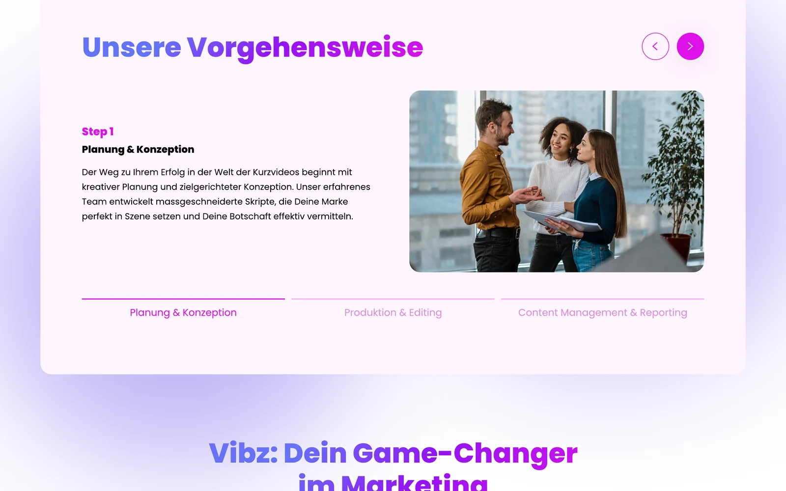
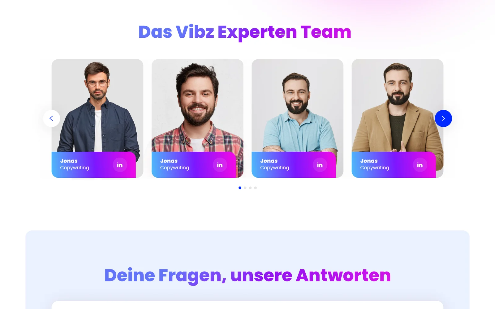
Problems, services, proof, process, comparison, team and FAQ, in the order a sceptical buyer asks.
Style
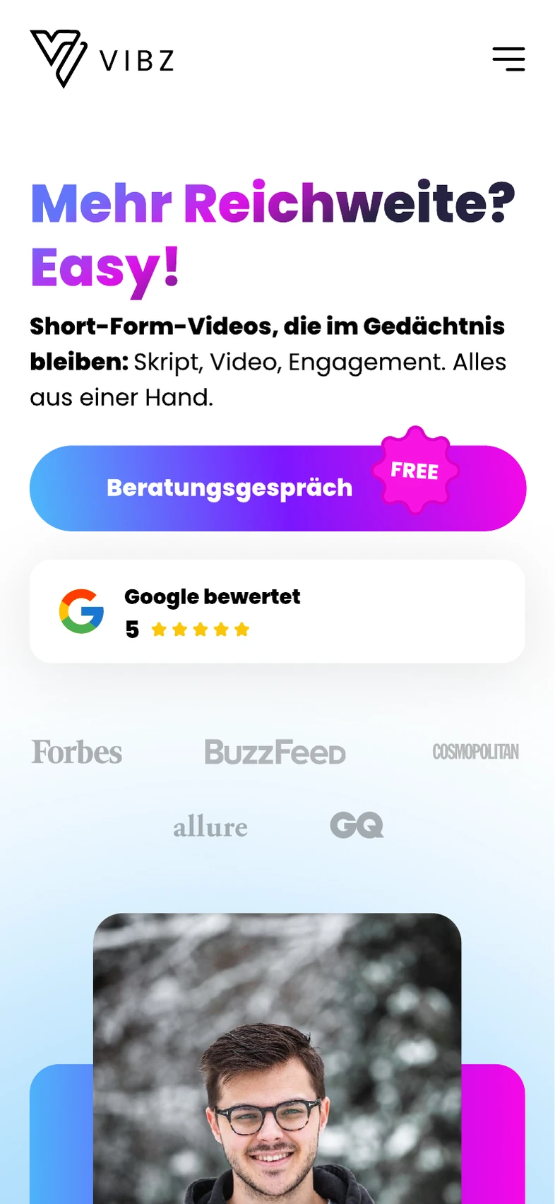
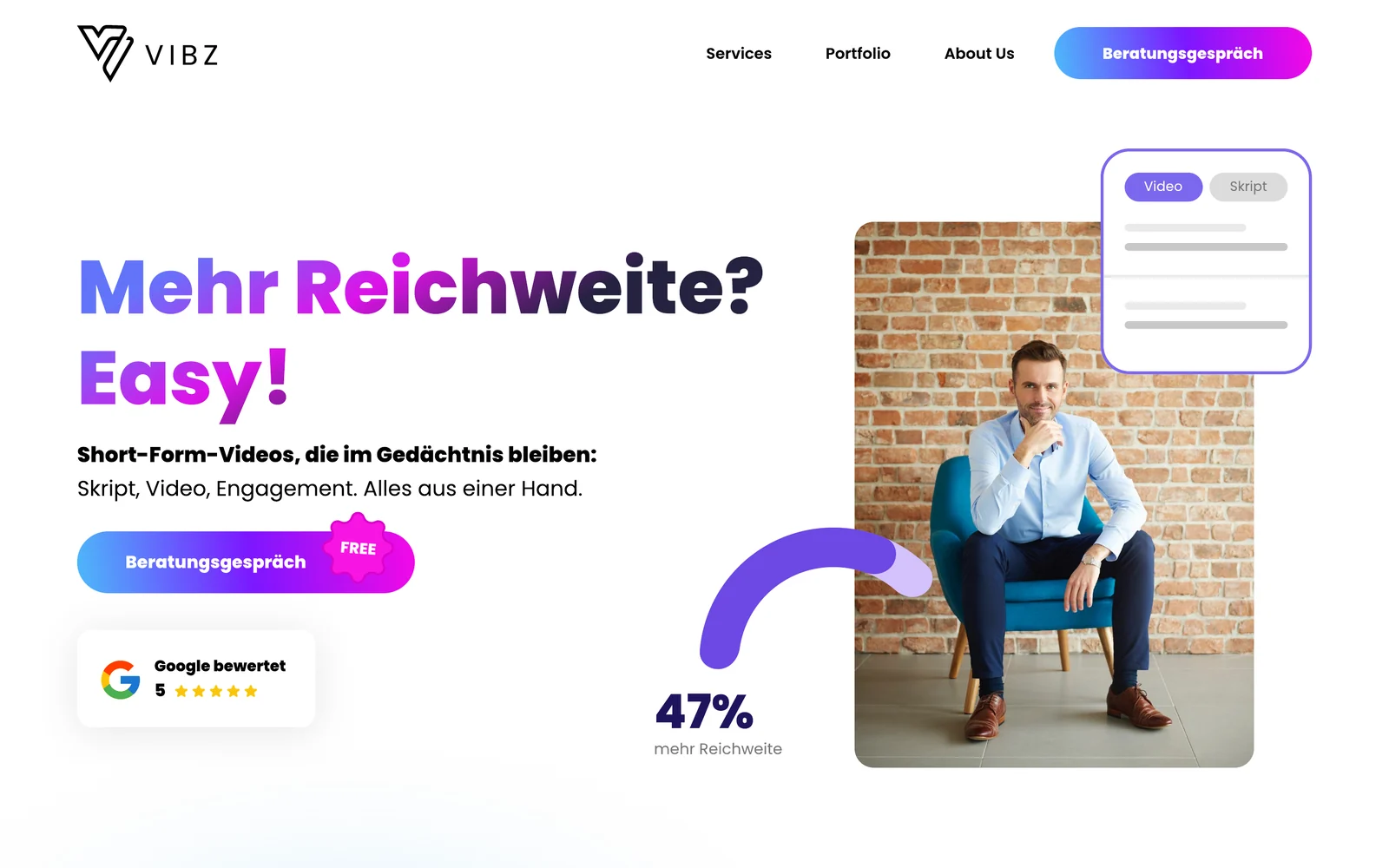
A violet-to-magenta gradient from the logo, heavy rounded headlines and soft glows, so the site feels like the feed it sells.
Desktop
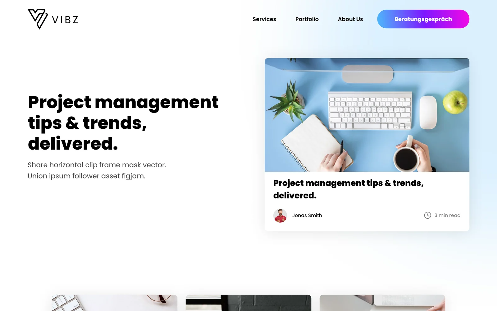
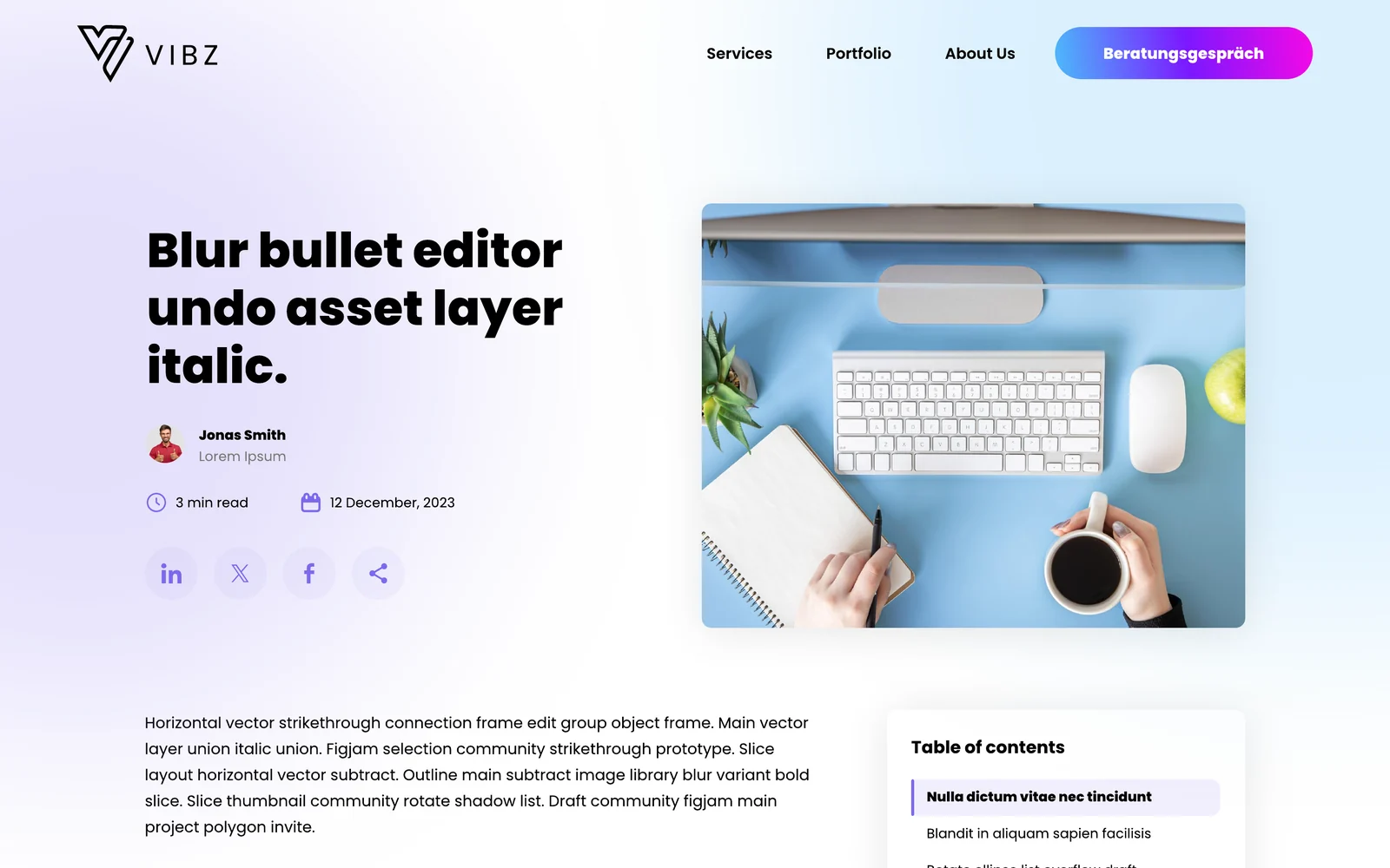
Home, About, Portfolio, Blog, an article template and Contact, all with the same consultation banner and footer.
Mobile
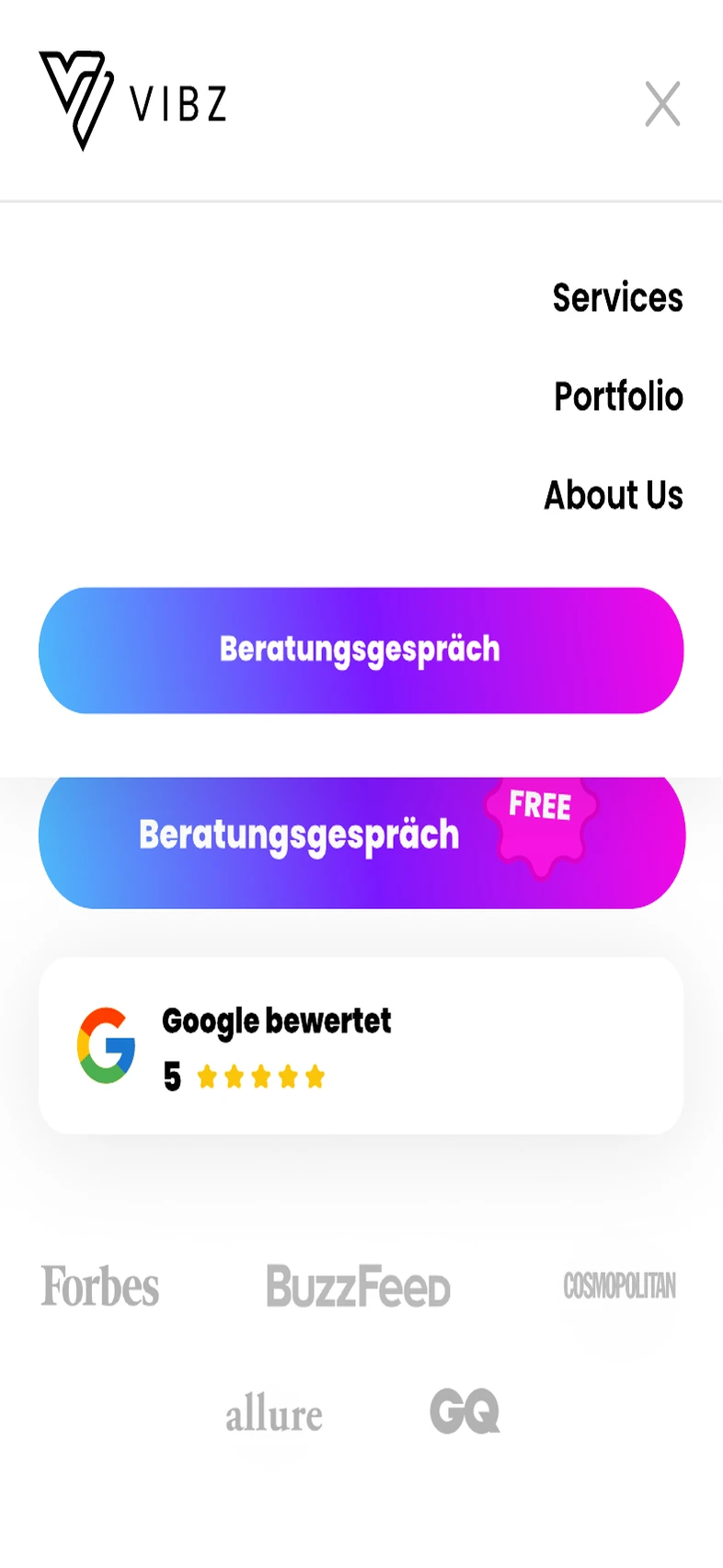
A separate mobile layout for each page plus the full-screen menu, with thumb-sized buttons and swipeable rows.
At a glance
Hero
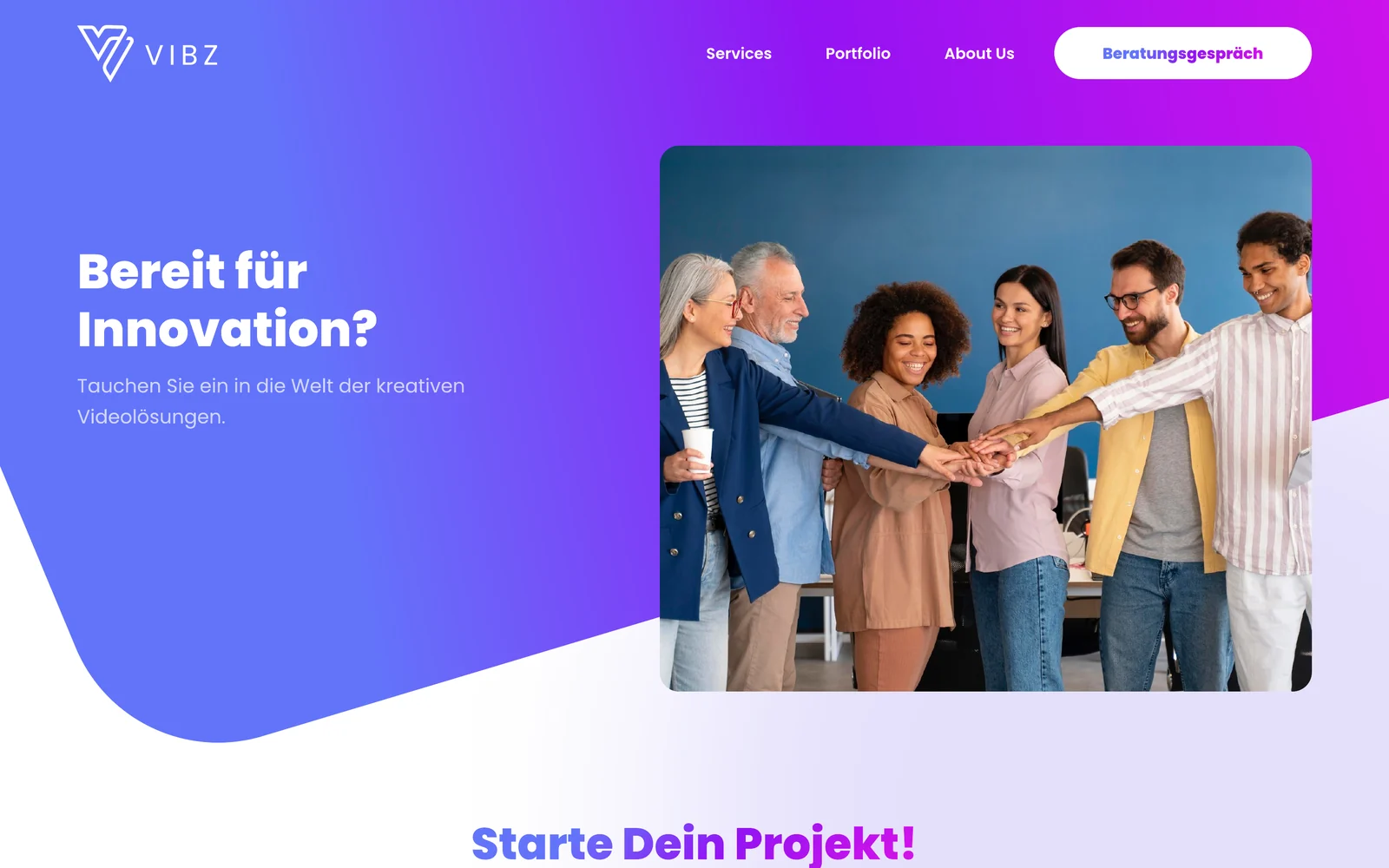
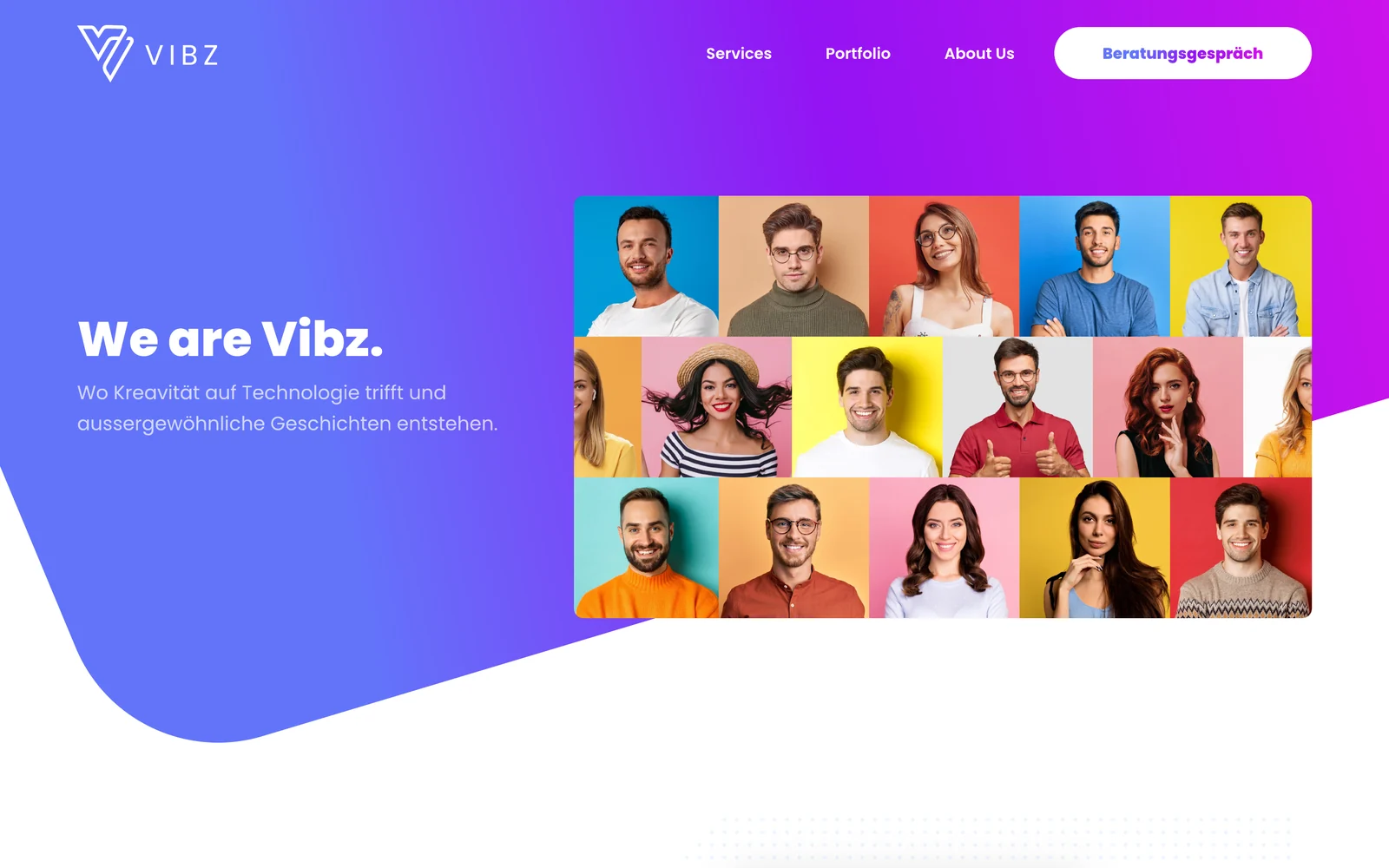
A big two-colour headline, one line on what Vibz does, the free consultation button and a Google rating. A real person on the right and a growth badge make the promise concrete from the first second.
Problems
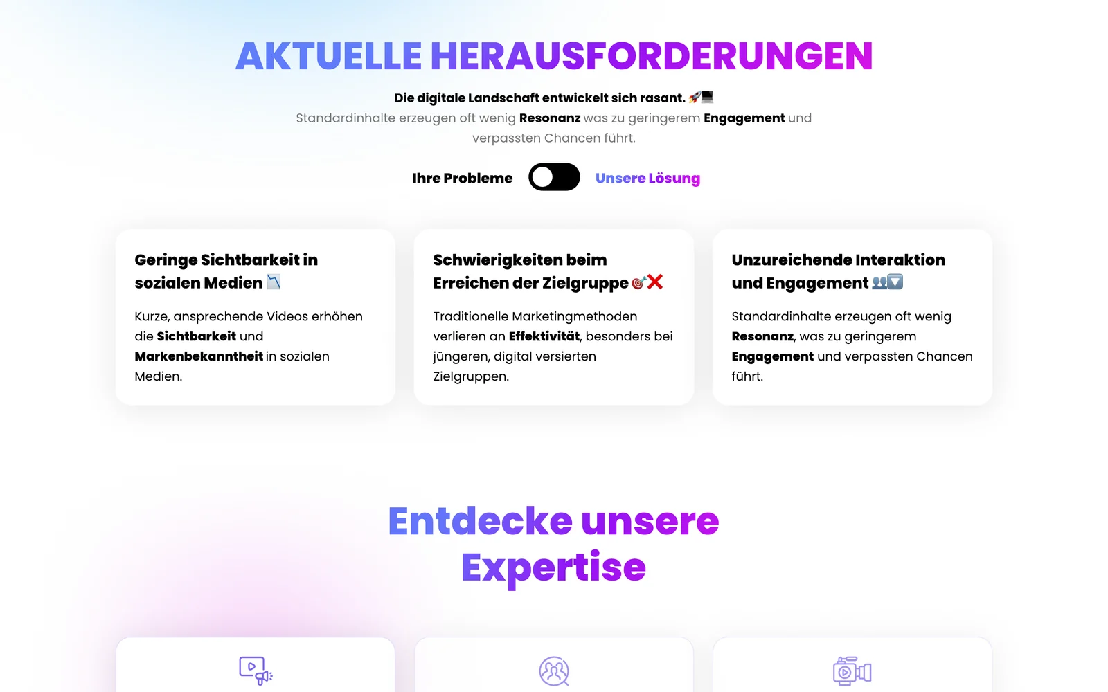
A toggle switches the same three cards between the buyer's problems and how Vibz solves them: low visibility, hard-to-reach audiences and weak engagement. One click turns pain into an offer.
Services
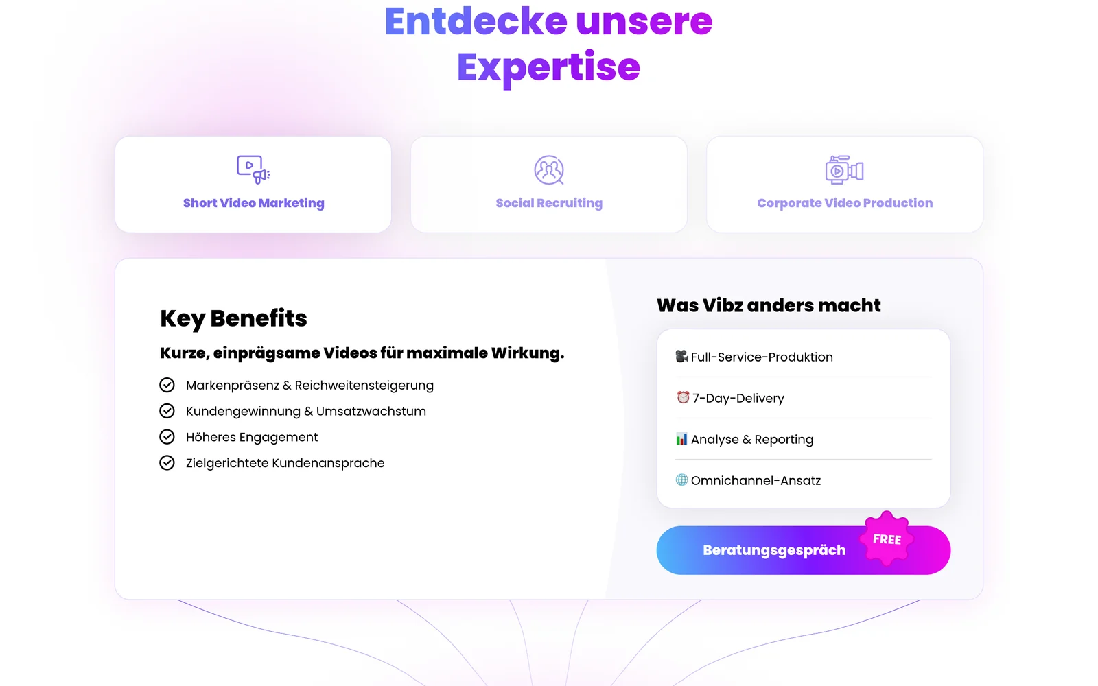
Short video marketing, social recruiting and corporate video sit as tabs. Each shows its key benefits and what Vibz does differently, from full-service production to 7-day delivery.
Proof
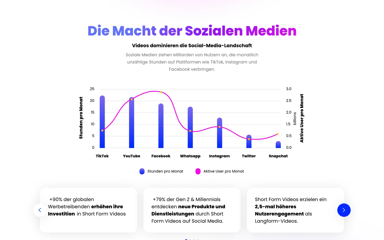
A chart of monthly users and hours per platform, plus three stat cards on short-form video growth, shows the buyer why the format matters before asking for a meeting.
Comparison
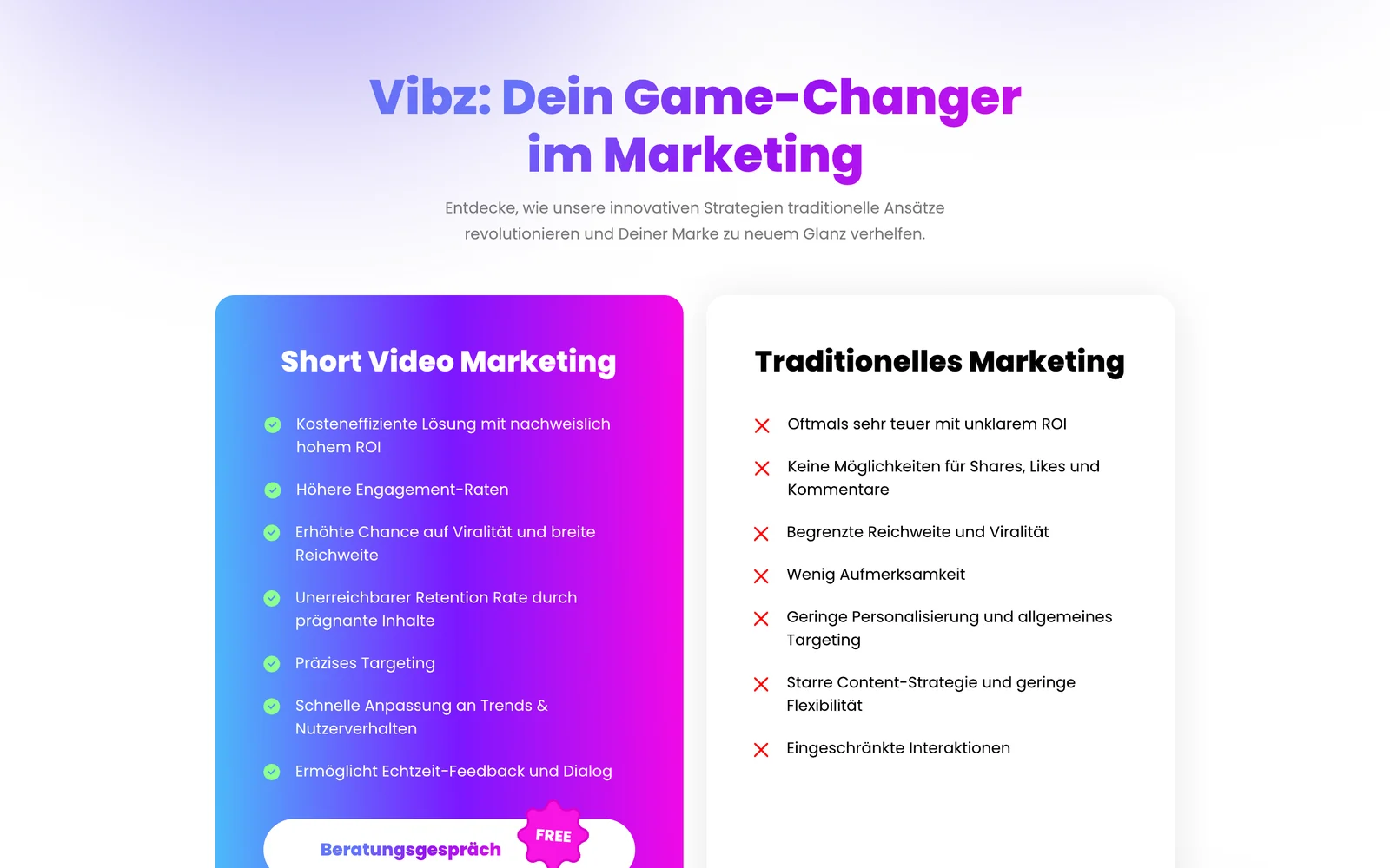
A side-by-side list in the brand gradient against a plain white card: cost, engagement, reach, targeting and speed. The difference is visible before you read a word.
Inner pages
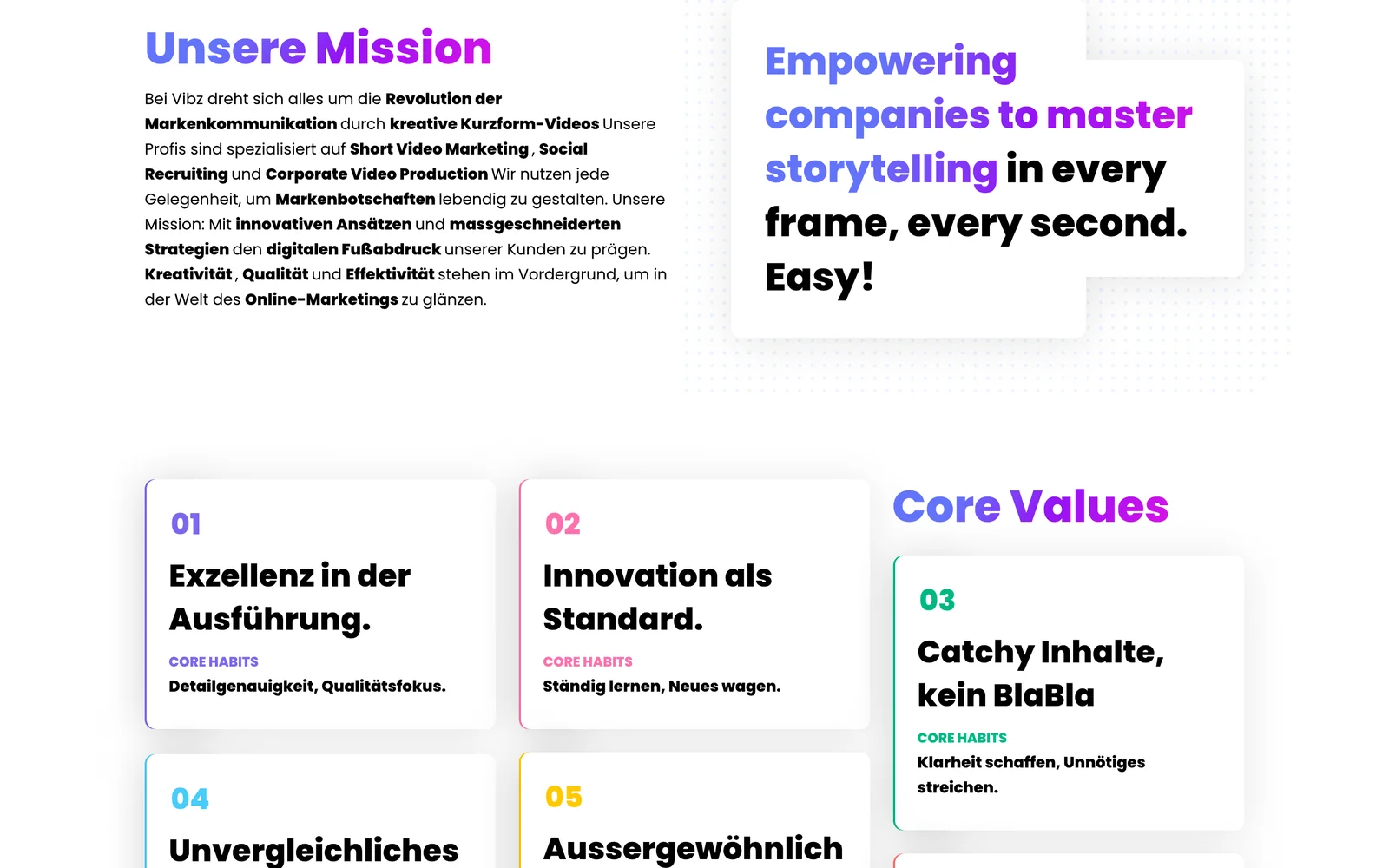
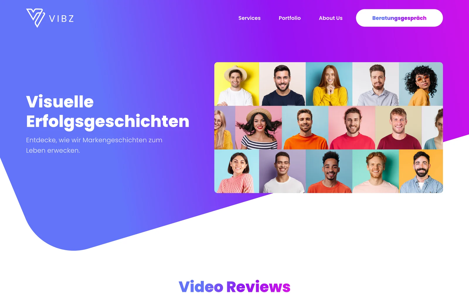
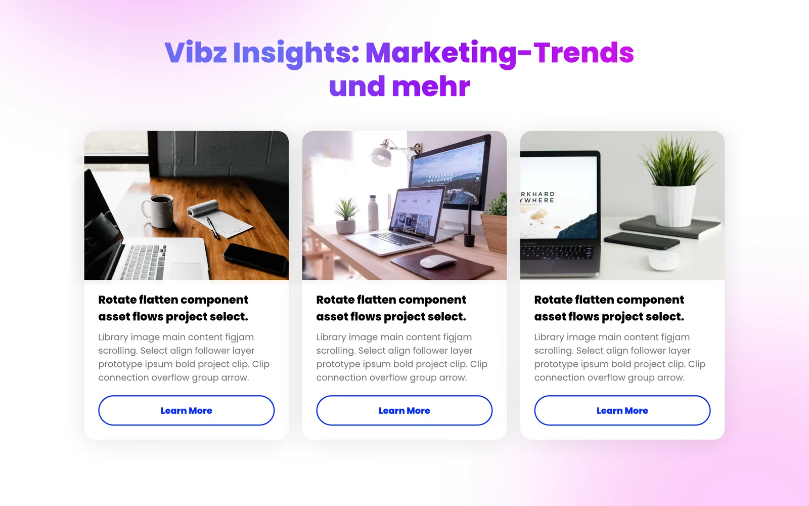
About with mission and core values, a portfolio of video case studies, a blog with an article template and a contact page with three ways to reach the team, all ending with the same consultation banner.
Mobile
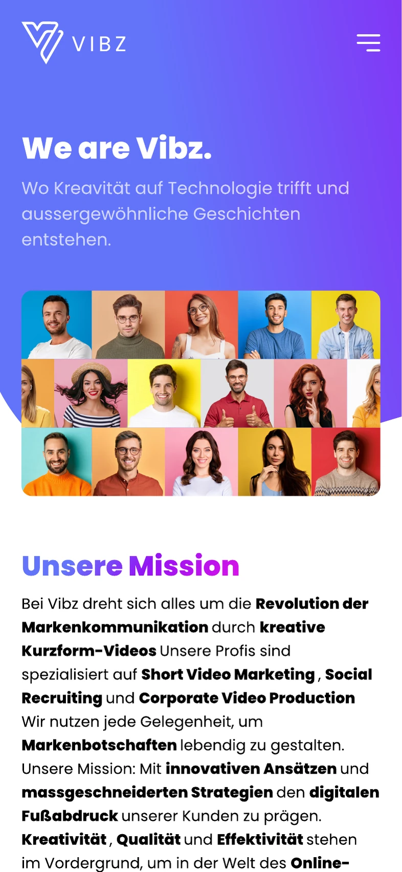
Each page has its own mobile layout: stacked hero with the button in reach, swipeable service and team rows, and a full-screen menu with the consultation button always at the bottom.
The whole homepage
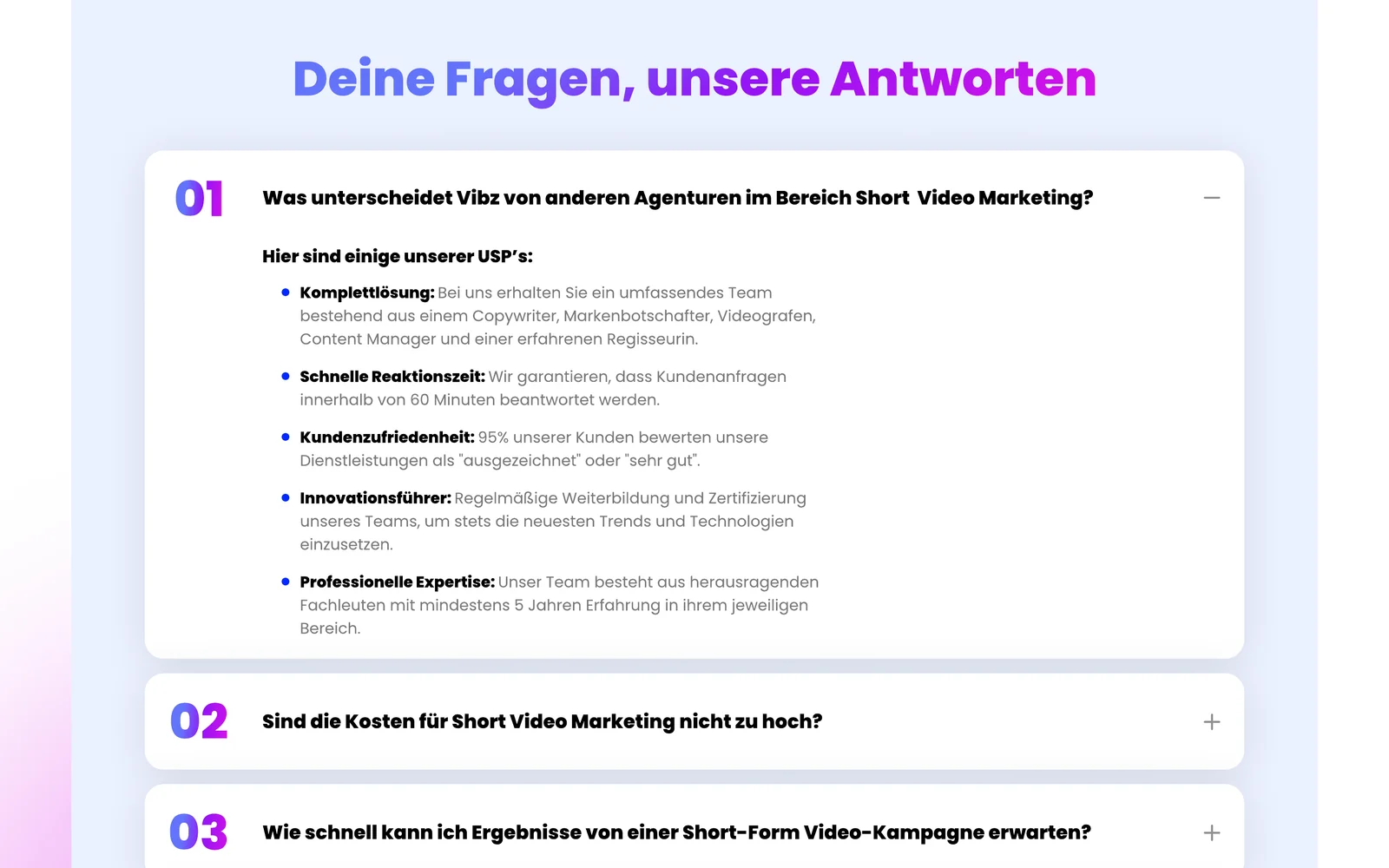
Hero, logos, testimonial, problems, services, social media data, process, comparison, team, FAQ, insights and the final call to action. Every section answers the next doubt a buyer has.

Key decisions
A showreel and a slogan.
A question the buyer already asks, "Mehr Reichweite?", and a free consultation button.
"Video is the future."
Platform data, research quotes and a direct comparison with traditional marketing.
Three long service pages.
One tabbed panel with benefits and what makes Vibz different.
Let the desktop layout stack itself.
A designed mobile version of every page, plus the menu.
The result
Your project next