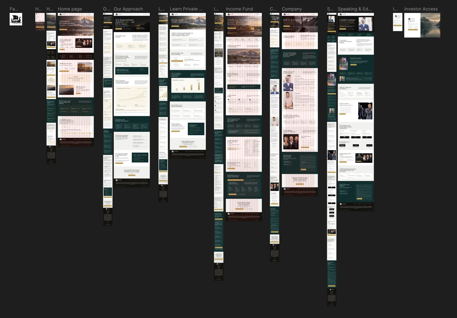
No foundation
Rough concept pages, no design system, no mobile layouts and no source files to build from.
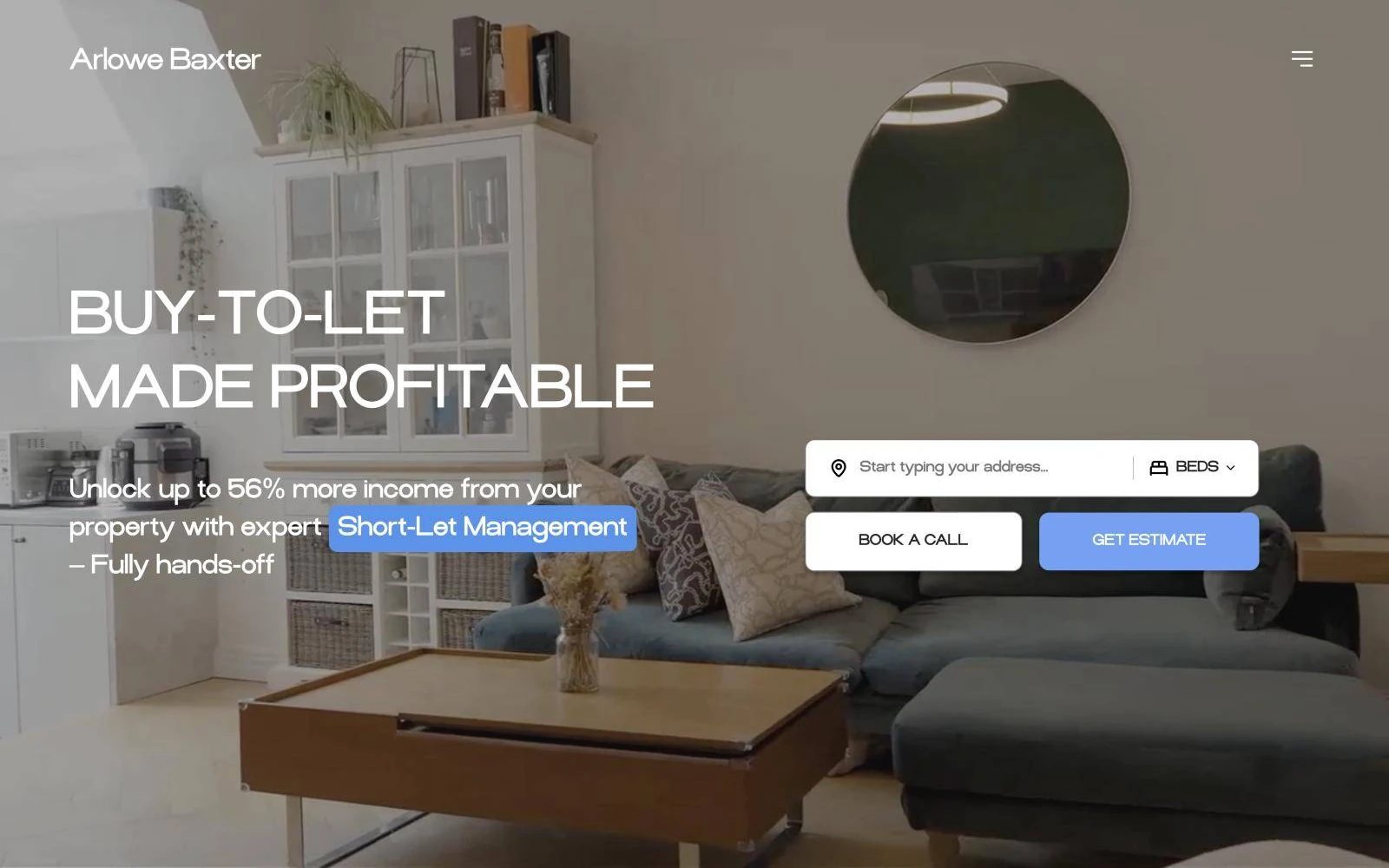
Fintech · Private credit · USA
Valhalla Capital Partners offers private credit investments to accredited investors and family offices. We took a set of rough concept pages, designed a complete system in Figma and built the site natively in Webflow, including a three-step investor eligibility check that routes qualified investors straight to the data room.
The challenge
Investors writing six-figure cheques judge a firm by its website before they ever read a term sheet. Valhalla needed to feel established, calm and compliant, and to speak to two audiences at once: experienced investors and people new to private credit.
The project started from rough concept pages with no design system, no mobile layouts and no source files. Before anything could be built, it needed a real foundation.
Rough concept pages, no design system, no mobile layouts and no source files to build from.
Experienced allocators and people new to private credit had to feel equally at home.
Offerings are only for accredited investors, and the site had to check that without feeling like a wall.
How we worked
We split the work into two clear stages, so Valhalla could sign off the full design before a single page went into Webflow.
Audit
We reviewed the existing concept pages, kept what worked and listed what was missing for a real build.
System
An editorial serif type scale, ink, cream and gold, and one set of components for every page.
Design
Every page designed for desktop and mobile, including the three-step eligibility check and the fund pages.
Build
Built in Webflow with the eligibility check on native forms, a CMS for webinars and clean, reusable classes.
Design first
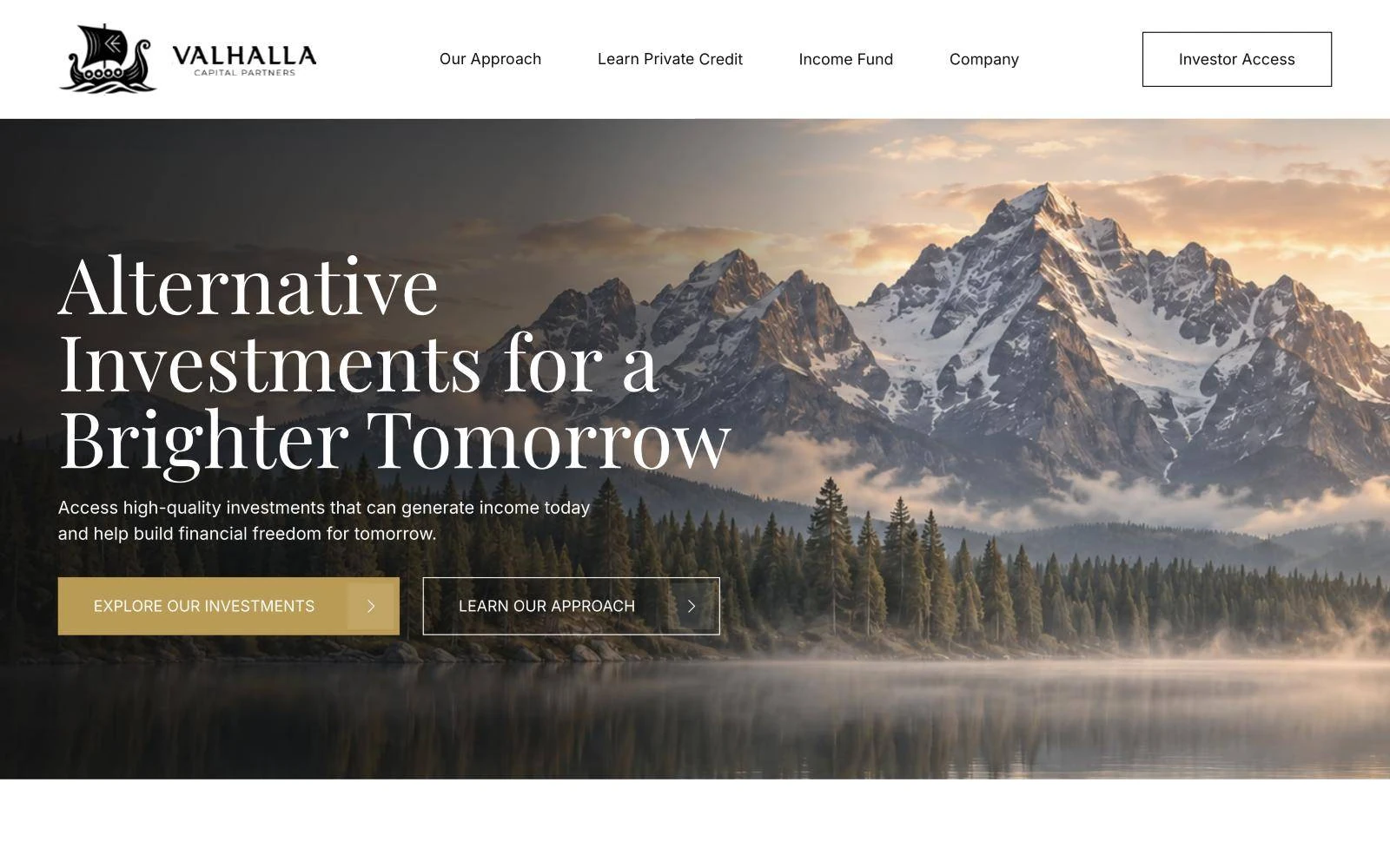
Every page designed in Figma for desktop and mobile, on one type scale and one colour palette, so the Webflow build had a clear blueprint and nothing was guessed.
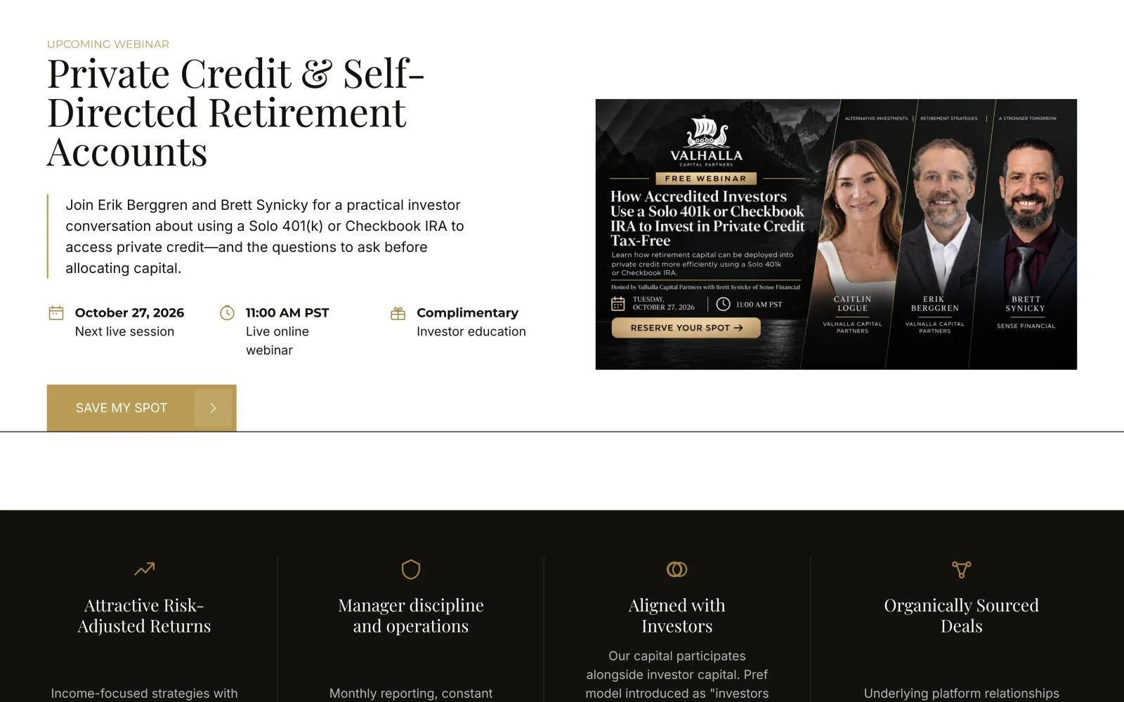
Education
An upcoming-webinar block with the date, time and format at a glance and a single "Save my spot" action. Built so the team can swap in the next session without touching the layout.
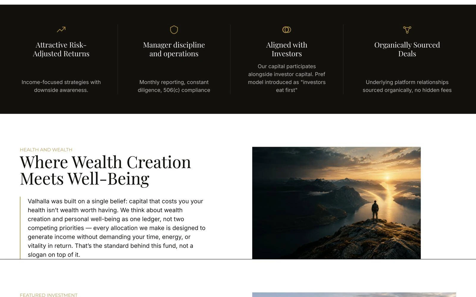
Credibility
Risk-adjusted returns, manager discipline, aligned incentives and organically sourced deals, each with a short proof line. A deliberate change of pace that reads like a fund factsheet.
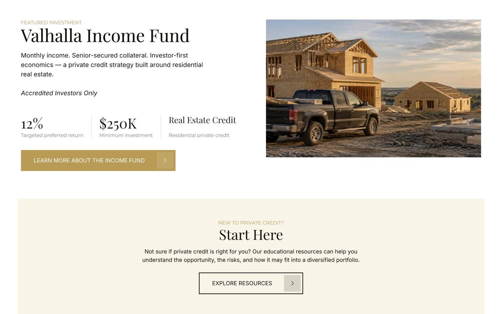
The fund
The featured fund leads with what investors scan for first, with targeted return, minimum investment and strategy set in large serif figures, and a clear "Accredited investors only" note.
Inner pages
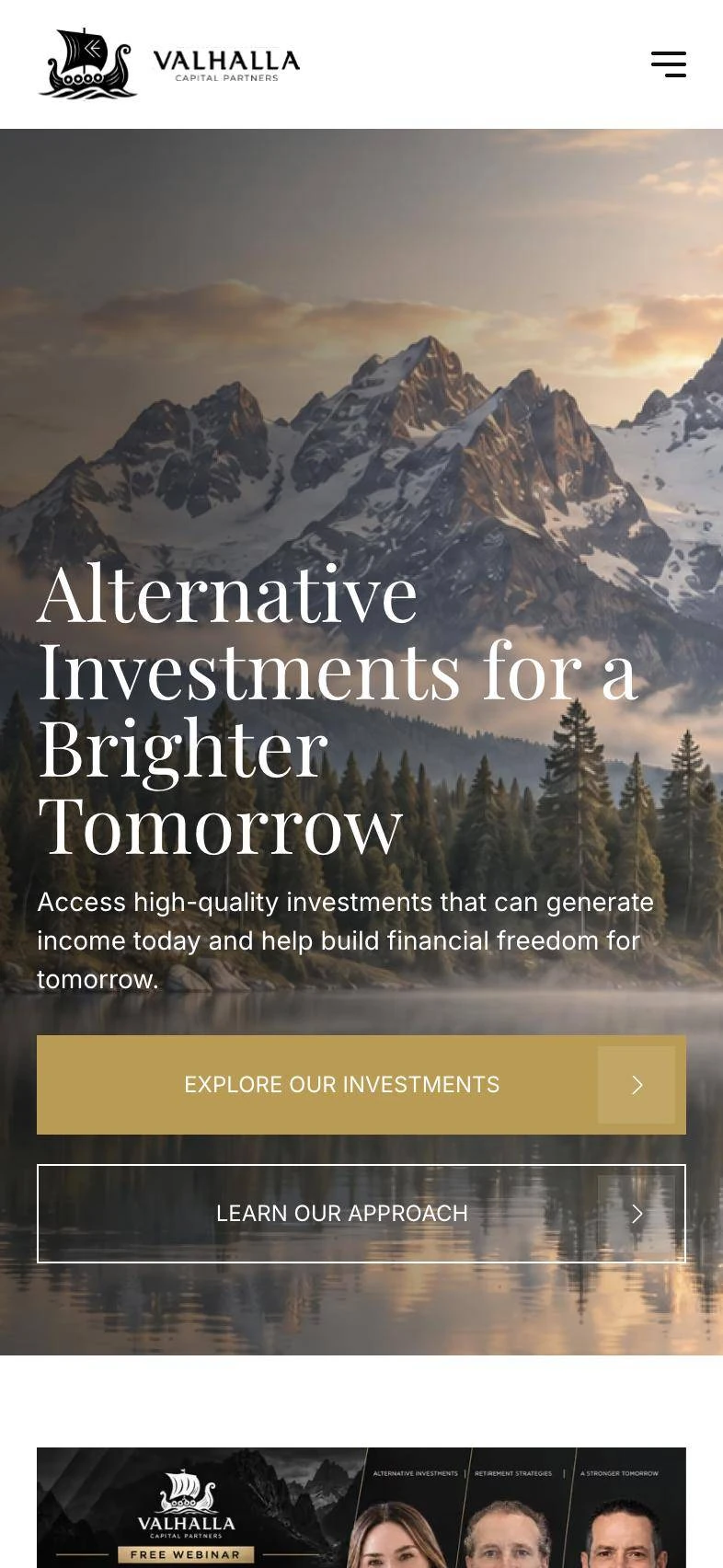
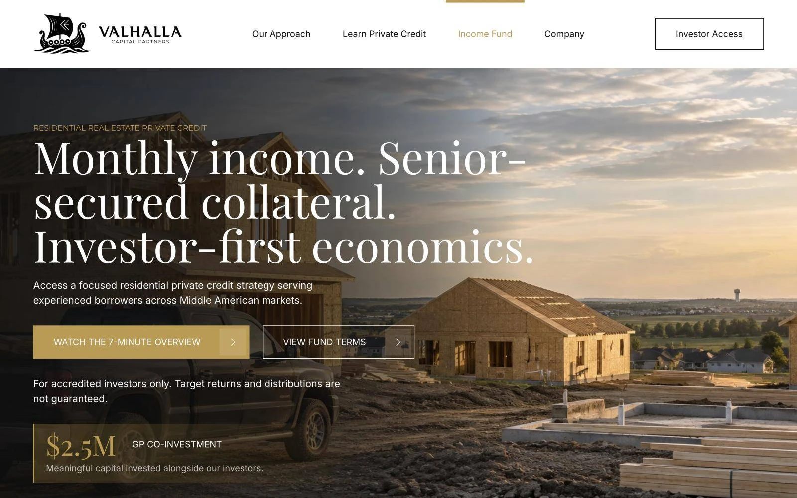
Each inner page starts with a full-bleed photo and a one-line thesis, like the Income Fund's "Monthly income. Senior-secured collateral. Investor-first economics.", followed by the detail for those who want it.
Mobile
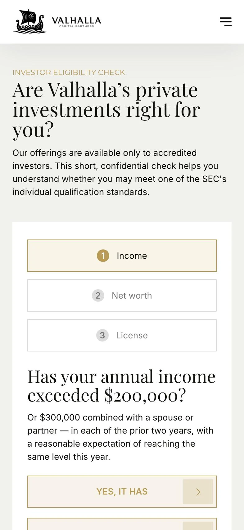
Designed for mobile in Figma, not squeezed afterwards. Full-width actions, a stacked eligibility check and serif headlines that keep their presence on a small screen.
Key decisions
A single "I am accredited" checkbox, or a paid third-party tool.
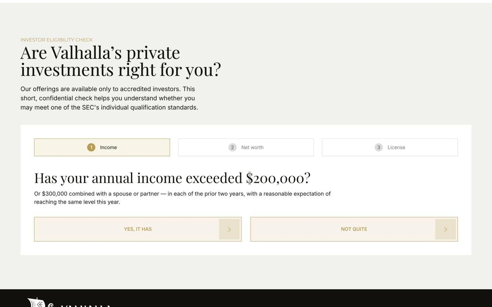
Three plain-language questions on native Webflow forms. One "yes" opens the request-access form.
A developer, every time.
A CMS collection, so the team swaps the session and the homepage updates itself.
A long story about the strategy.
Key terms first: targeted return, minimum investment and strategy in large serif figures.
Navy blue and stock skyscrapers.
Cream, ink and gold with an editorial serif: calm, established and discreet.
"Extremely responsive and moved quickly. The website was exactly what I was looking for."
CCaitlin Logue
Valhalla Capital Partners
The result
Your project next